Latest news about Bitcoin and all cryptocurrencies. Your daily crypto news habit.
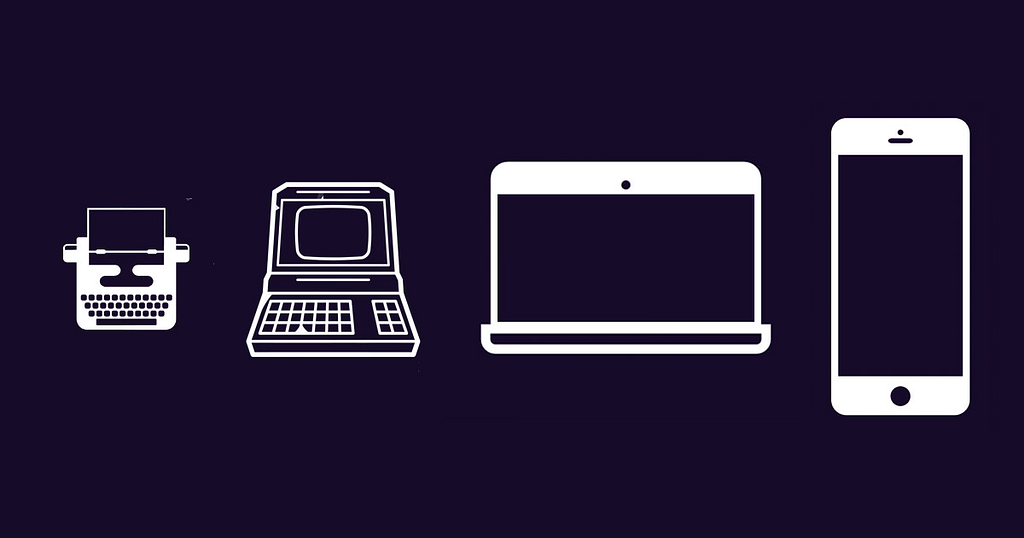
Yesterday, my co-founder and I put together the “Museum of Websites” to showcase the evolution of popular websites. Since we’re both front-end design lovers, it was fun to put the project together and inspiring to see the humble beginnings of today’s tech giants. In this post, I’ll share three learnings from browsing the historical design trends of the web’s most popular landing pages.
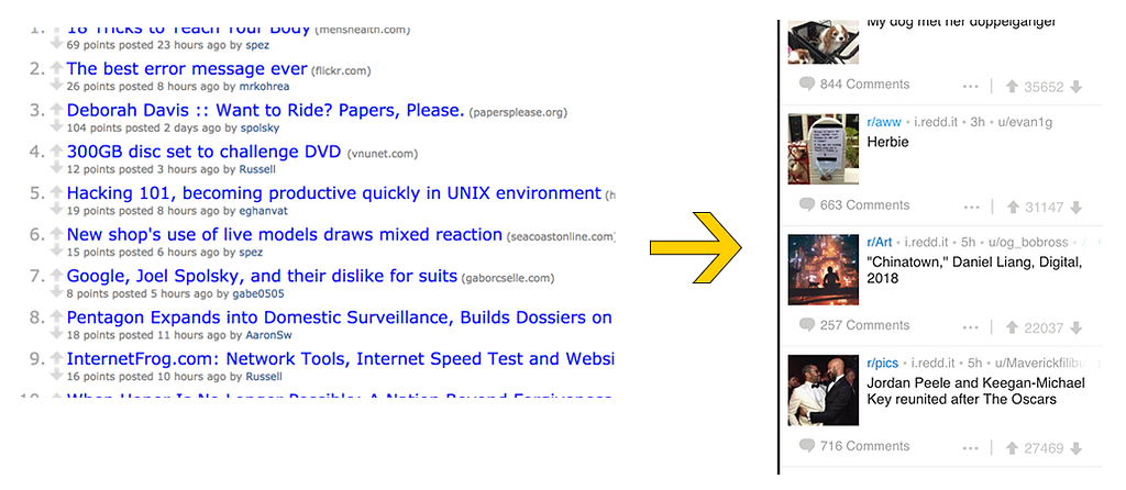
 One: More media and bigger images
As the world has moved towards smaller screens, websites have made their images larger. Increasingly, media (images and video) take up more real estate than text. See Reddit, Product Hunt, Amazon.
 Two: Banner ads
Having a single splash ad across the top of the website, usually with visuals and color, seems to be an increasingly popular design choice. Check out Airbnb, Yahoo, the New York Times.
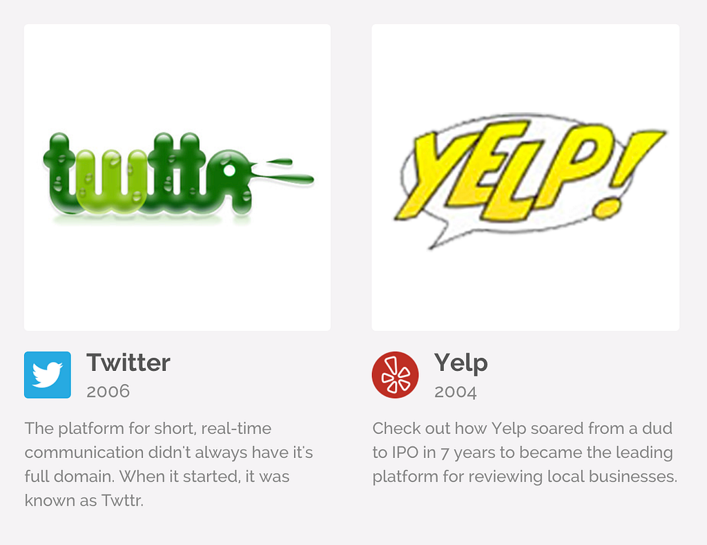
Three: Logos change
Generally, I think of logos as static, an unchanging stalwart that grounds the website in a brand. Actually, most (all?) of the biggest tech companies have changed their logo, and most have changed it several times. See if you recognize the original not-so-iconic logos of Twitter, Yelp, Pinterest.
Thanks for reading! Check out Kapwing’s Museum of Websites for more design learnings.
3 Trends in Web Design from the Museum of Web Design was originally published in Hacker Noon on Medium, where people are continuing the conversation by highlighting and responding to this story.
Publication date
Disclaimer
The views and opinions expressed in this article are solely those of the authors and do not reflect the views of Bitcoin Insider. Every investment and trading move involves risk - this is especially true for cryptocurrencies given their volatility. We strongly advise our readers to conduct their own research when making a decision.