Latest news about Bitcoin and all cryptocurrencies. Your daily crypto news habit.
Here’s week 1 and week 2 if you’re interested in the journey so far.
If you’re on a bad or expensive internet connection and don’t want to download 800 pictures as you read an article, then you should run, run for the hills!
Also, before I go on, a disclaimer. If you’re wondering if you should make decisions based on anything I have to say, I would suggest locating and spending some time with a three week old baby. After some quality time with the the bub, ask yourself if you consider them a good source of life advice.
I read somewhere this week that there had been more than one bubble in bitcoin. Maybe I already knew this but had forgotten, but regardless, I got to wondering about the shape and character of these bubbles.
So for the past seven days, like standing in a fancy bath, I’ve been knee deep in bubbles.
By my own definition, there are six of them. Here they are.
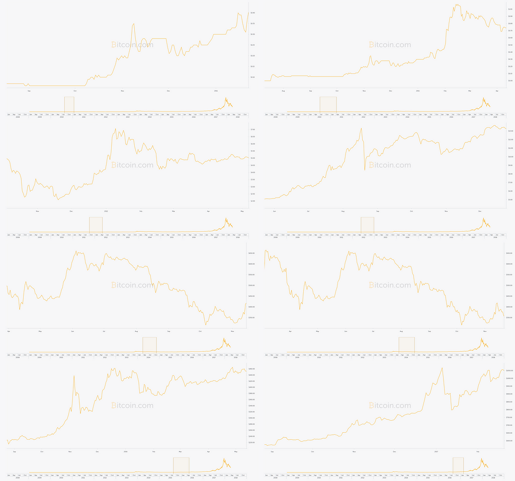
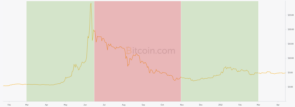
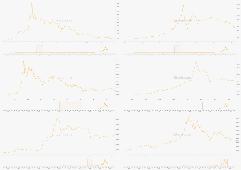 Unnecessarily low contrast charts provided by bitcoin.com
Of course defining a ‘bubble’ is a little bit subjective, so let me show you the other points in time that were — like lemonade opened more than four hours ago — not bubbly enough for my liking:
 I considered doing them Brady Bunch style, with Alice in the middle.
A non-starter
I began by attempting to catalogue the metrics of each of the bitcoin bubbles, trying to quantify them, thinking that there might be some sort of easily-identifiable ‘signature’. Something super-useful like, the price always drops to 80% of the price before the bubble.
(I tend not to think about whether someone else would have already tried something before jumping in. That’s how I invented honey.)
I spent quite a lot of time with a calculator and my charts, producing such gems as this:
 The anatomy of a bubble, but not really
And this…
 It’s like a reverse jail — bars in cells
I urge you to not spend too much time looking at the above; there were all sorts of poor logic involved in this endeavour. I blame the fact that I had a cold, which I was treating with the ancient family remedy of rum and charts.
(Hey, it’s not drinking alone if I can hear the neighbour’s TV.)
The major floor in my logic was the thought that a bubble has a ‘start’, which I no longer think makes sense. As such, many of the columns above are pointless. Even picking an ‘end’ is too subjective to be predictive.
But this exercise did reveal something quite interesting…
The bubbles from 30,000 feet
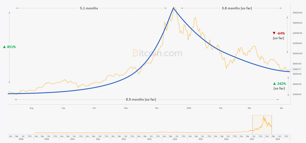
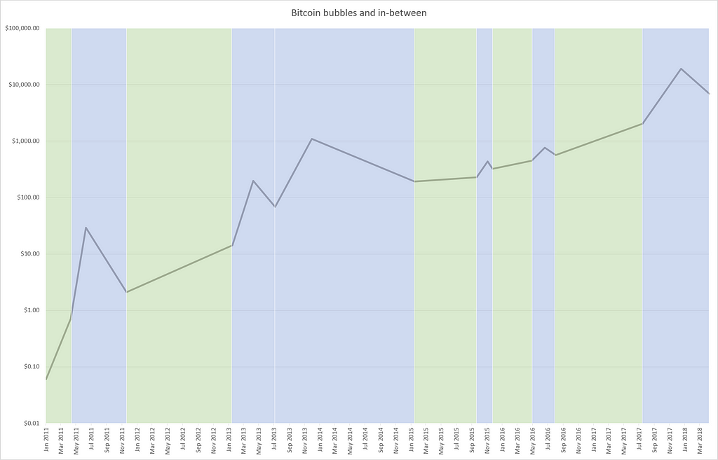 Bitcoin from 6c to $20k in 7 years
In the chart above, I plotted the start, peak, and end of each bubble. These are the six blue columns. The green is simply the in-between and in hindsight I didn’t really need the green at all.
The y axis is logarithmic — each horizontal grid line represents a 10x increase in price over the one below.
So that’s about 10x every 18 months.
1,000% every 18 months!
But enough exclaiming … the part I found really interesting was the space between these bubbles: without fail, the price always increased. In fact, the point that I’ve called the ‘end’ of the bubble was, in all cases, the last time the price was ever that low.
This is probably a good time to address the fact that all this only matters if history is going to repeat itself.
And that’s
 a big if
As I sat staring wistfully at my stripey chart, I came to realise that a good long-term investment strategy might be something like this: my ‘default’ position is to own some bitcoins (as much money as I’m willing to lose).
I then look for the the tops of bubbles, where I will temporarily get out of the market, then get back in a little while later once the worst is over.
These no-go zones would look like this:
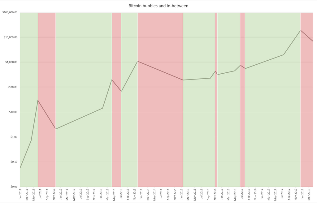 Green = own bitcoin. Red = do not own bitcoin.
I’ve left my somewhat artificial ‘start’ points in just so the line is the same between the two charts.
I lie, I left them in because I’m lazy.
I’m not even going to bother calculating what my earnings would have been with this strategy, because I’ll get all giddy and that doesn’t help anyone.
This leads to the question: how capable am I at picking the top of a bubble, and the bottom of the down-turn after a bubble?
Coming up, I will go through the tops and bottoms of each of the six bubbles.
But before I jump into that, there’s…
A spanner in the works
Quiz time. The two charts below are two different scenarios. In the first one, I just bought and held onto bitcoin for the whole year, riding out the bubble. In the second, I sold during the downturn after the bubble that occurred in June.
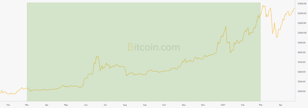 One trade. Ride ’em cowboy
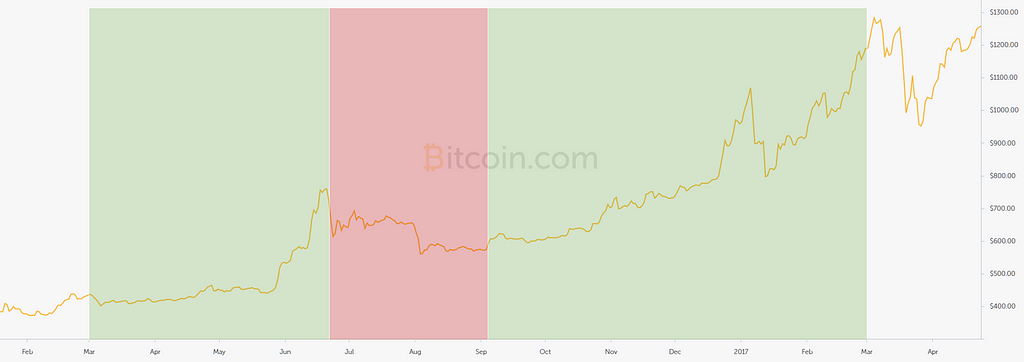 Two trades. Sell on the way down at $665 and buy again down at $595
In both cases I start with $10,000, and let’s assume there are no transaction fees.
In the first scenario I wind up with $17,500 and in the second I’ll have about $21,700 — a decent 25% more.
But then, the tax man cometh.
And the (Australian) tax folk have been quite explicit about cryptocurrencies and capital gains tax — if you hold it for over 12 months, you pay half the tax. The clarity is appreciated even though they are dirty thieving scoundrels for taking my hard-earned coins.
Because the bitcoin in the former chart was held for 12 months, I’d only pay tax on half the profit, but the bottom will be taxed at the full rate (45%). So the final numbers are:
Scenario 1: $23,498.03
Scenario 2: $21,366.45
So tax is actually quite integral to a strategy where I might keep it for a whole year or might not.
But this is for a small bubble. What about the bigguns?
Well that’s a different story.
 I’m trying to be only mildly optimistic about where I might sell and buy
Obviously, stepping to one side while the market loses 80% of it’s value is going to make a big difference. In this situation, my initial $10,000 would become:
Scenario 1 (holding, half-tax): $41,700
Scenario 2 (selling for the red part, full-tax): $155,000
I’m sure there no golden rule, but I think if there was to be a bubble some time this year, and I already had some bitcoin, and the bubble was only 100% up from its base, I’d probably make no effort to sell at the peak and just ride it out.
This is all very wishy washy and reliant on history repeating itself, but I have convinced myself of one thing: buying and holding bitcoin with a decades-long view is something that I want to do.
Predicting the popping of the bubble
It may be years until I need to do this, so it’s premature to an extent, but I figured it would make for some good practice: can I spot the top?
I thought I’d start by following my gut (maybe that second brain down there is good at trading, you don’t know) — is there anything obvious that might alert me to the arrival of the peak of the bubble?
And as with everything, I’m trying to prove the negative too. Can I look at a pointy bit and say “yep, that’s the peak of this bubble, I totally would have sold on exactly that day”, but also be able to say “sure, that looks like the peak, but it’s not, just you wait and see.”
So, I went through all the peaks, final and faulty, to see what they looked like.
What I found is that I suck at picking the peaks.
If you’re wondering whether or not you suck too, you’re in luck, because I have a game!
I’ll show some screenshots of points in time that were the peak of a bubble — the ideal time to sell — and some that were just steps along the way.
I call it “would you have picked the peak”, because I am not very imaginative (like the person that named the black bird).
Let’s start with a real peak to see what one looks like. For this, we will head back to the simpler times of 2010 before everyone lost their minds.
 A real peak
You can see that growth is pushing upward, and the volume is strong, but the RSI (the purple line) is ‘overbought’. What’s more, it’s tried to break through the psychological barrier of $1 two days in a row but pulled back before close.
Of course I’m lying and that’s not a real peak, so let’s fast forward a few months…
 A real peak
Now you can see that what looked like an unsustainable climb to a stratospheric $1 (how it must have seemed at the time) did correct a small amount, but then the price proceeded to move up by 800%.
You can see volume is growing and we’re still way above average, but look at that RSI, talk about overbought! She cannae take any more, captain!
Of course that one isn’t the real peak either.
 The third one is always the real one
Another month passed and the price tripled. That initial buck that looked so much like a peak is now just a blip. The RSI is once more right up at 100%, and the volume is high. To my young eyes, this is indistinguishable from the prior example.
But that really was the peak and after tapping $30 the price tumbled.
Maybe that was more screenshots than I needed, but this is to drill it into my own brain that I’m not capable of picking the peak of a bubble just by looking at the steepness of a line and muttering things like surely it can’t go any higher.
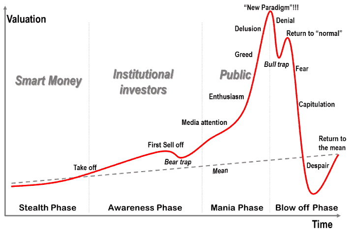
So, I know that I can’t pick the very top of a bubble (although I won’t stop trying), but what about picking a sane point to sell. I’m going to share this chart again for reference, because I’ve got my eyes on that second hump, the one labelled “Return to normal”
I’ve just got word that each of the six bubbles are ready for their close up…
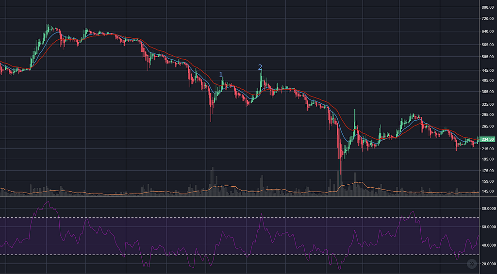
June 2011 bubble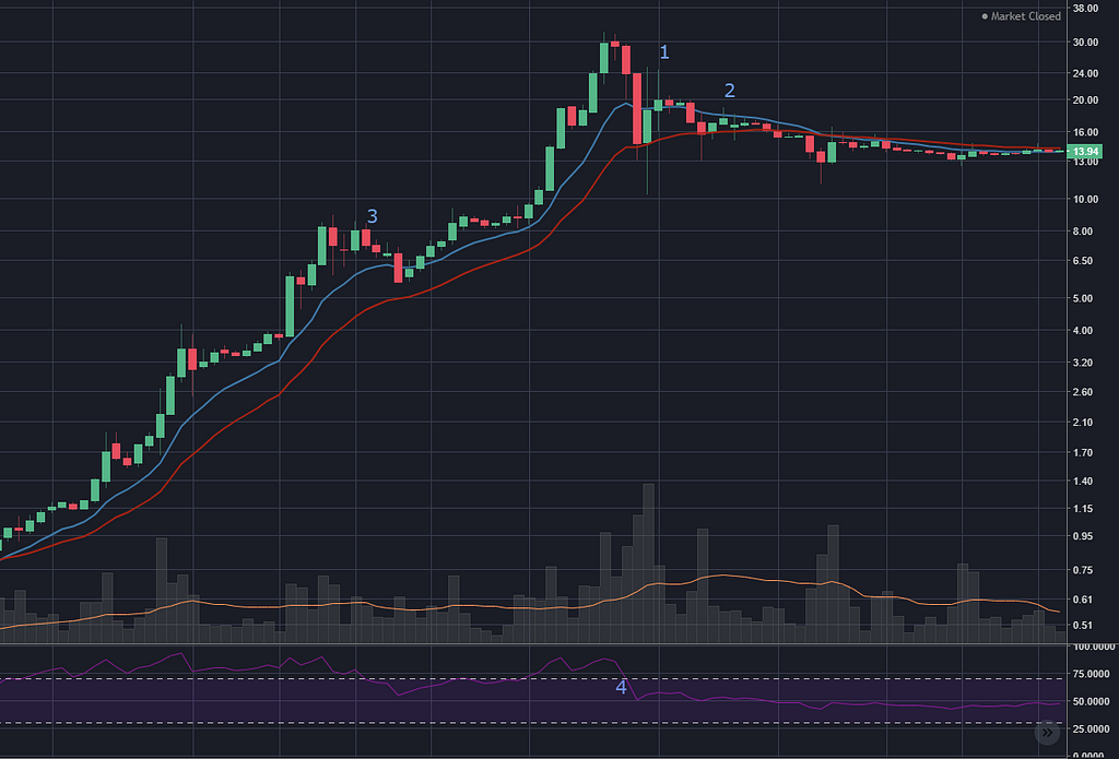
That ‘lower high’ at point 1 would have been an OK signal (is that even a ‘lower high’?) and point 2 would have been good confirmation of a downtrend.
The RSI (the purple line) had dipped below 70% a few days earlier (point 4).
But there was also a ‘lower high’ (only just) at point 3 on the climb to the top. So selling too eagerly would have been a mistake.
The exponential moving average lines (at 12 and 26 days), make a good — if a little late — sell indicator when they cross about a week later.
This is the one of the few bubbles where the RSI going down below the 70% mark would have been a false sell signal (half way up the slope, also at point 3).
April 2013 bubble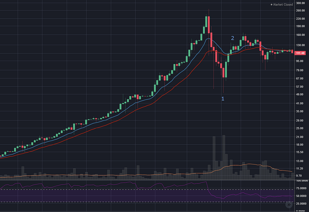 Check out how long that RSI stays above 70%! That’s a steady 1800% climb.
Again, a lower high (2) would have been a reasonable spot to sell, withe the RSI going over 70% 9 days earlier.
If I had hung on a few days longer I might have thought that the uptrend was back on, and it would have been another few weeks before I realised that nope, it was a downtrend.
The EMA crossover ‘confirms’ the end of the uptrend about a month after it happens. Good one, EMA.
Note that point 1 is a drop of 80% over the peak. So it would have been a nail-biting six days to watch 80% of my money disappear, thinking where the hell is my second little lump.
Hopefully, when I find myself in this situation in the future I will go back through past charts and reassure myself that this is just the personality of the bitcoin price chart.
November 2013 bubble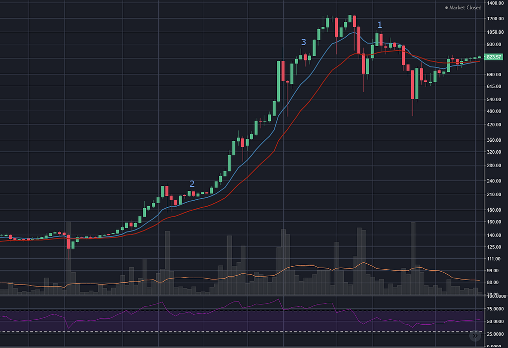
A rare double-peak. November 2013 just had to be different. There is a nice clear lower high 6 days after the peak (1), and the RSI dropped below 70% a few days earlier.
Yet again, the red line moves above the blue, a little bit alter for the slow folk.
Looking at the fakers, there are two very shallow lower highs at points 2 and 3 on the way up. I need to learn to clearly distinguish these from the real signals.
November 2015 bubble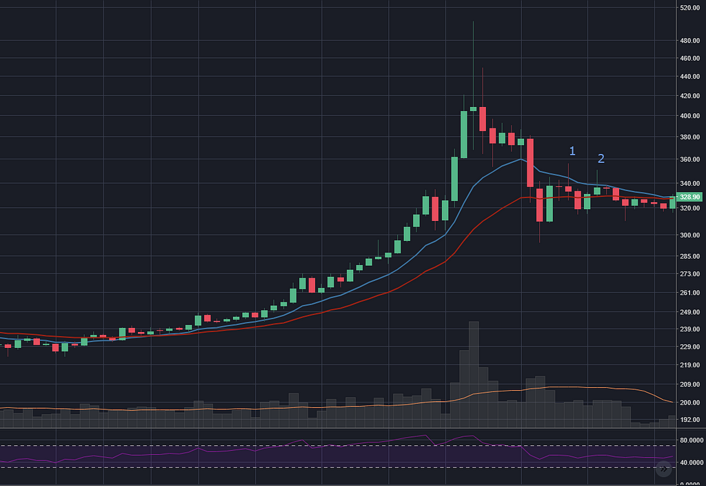
This is an interesting one for a few reasons. The lower highs at 1 and 2 are candlesticks that aren’t actually closing as lower highs, it’s just the wicks sticking up. The RSI had dipped below 70% 6 days earlier, and a week later the EMA lines crossed, but still, it’s not a very convincing downtrend.
Perhaps that’s linked to the fact that it wasn’t a very impressive bubble to begin with.
But, like I said earlier, if I had tax in mind, for a bubble this small I would have just stayed in the market anyway if it meant I might be able to keep my coins for over 12 months.
It’s probably worth me reiterating that these are only ‘bubbles’ in my mind. I could have called this not a bubble if I wanted to. You are reading the observations of a three-week-old baby.
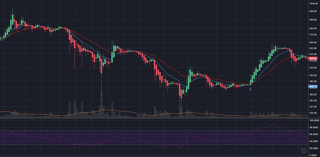
June 2016 bubble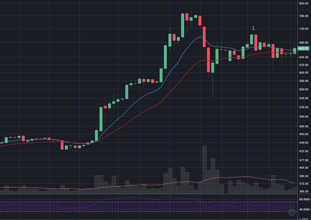 A modest 80% bubble bump
More of the same (which is excellent). The RSI drops below 70%, which should have put me on alert. I ride out the big dip like a tough guy, hanging on for that lower high as 30% of my money disappears. Point 1 arrives and I exit with class and dignity (something I’ve always wanted to do).
December 2017 bubble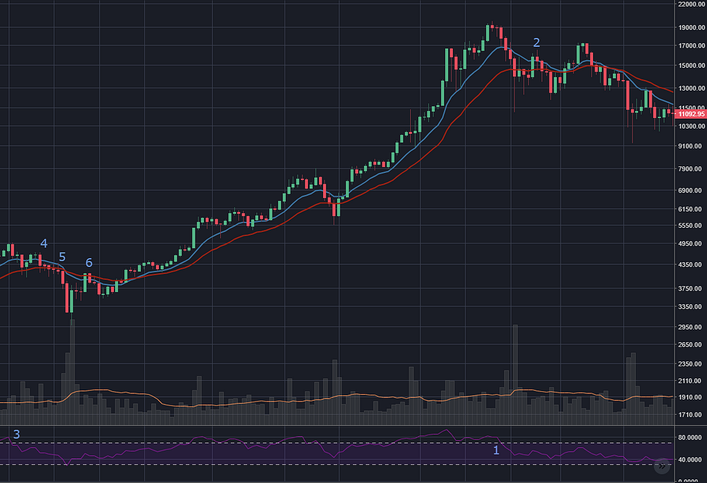
And finally, Big Bertha from last year. The RSI dropped below 70% (point 1) and there was a nice crisp lower high (point 2) 10 days after the peak, after an interim drop of 40%.
Note though that on some exchanges (not the one in the screenshot) it also technically made a lower high right before the peak. So, that’s an interesting thing to keep in mind.
Curiously, the price reached its zenith (because I’m sick of typing ‘peak’) on some pretty mediocre volume, with the RSI not doing anything particularly interesting (although now I look at my screenshot, is that ‘bearish divergence’ in the RSI when the price made a higher high but the RSI made a lower high?)
And once more, the EMAs cross over about a week after everyone else knew the uptrend was over. Thanks for showin’ up, guys.
But there’s more. Last years uptrend had a lot of things that I would have considered sell signals on the way up. One example is the RSI at point 3, followed by three lower lows and even the EMAs crossing over. This happened several times on the way up, and I’m pretty sure that, with my current skill levels, I definitely would have sold at these points.
So I guess I always need to be ready to jump back in when these things prematurely eject me.
Summary
All in all, the ‘lower high’ seems like the best indicator that a bubble has burst, FOR THESE SIX BUBBLES.
Bubble number seven will potentially, possibly, probably, maybe, who-knows, be quite different.
Picking the end of a down trend
I have naively convinced myself that I will be able to pick the top (or somewhere near it) of the next bubble.
But the more pertinent question is: can I pick the end of the downtrend that follows a bubble, for example the downtrend that we are right in the middle of (as I write this on April 15, 2018).
This seems a lot harder.
The low point after each peak took a wide range of months to appear (0.7, 1.5, 2.9, 3.8, 5.4 and 13.7 if you must know). And the magnitude of the drop varied widely too (down anywhere from 26 to 93%).
And the downtrends are also just generally messier than the uptrend of a bubble.
Please, join me while I go through each of the bubbles again, looking at the downtrend after the bubble burst.
Just like with the top of the bubbles, I’m looking at the price + volume, with the lagging indicators of 12/26 day exponential moving averages, and the RSI.
For a change of pace and an unnecessary lack of consistency, I’m now using Heikin-Ashi candlesticks.
Here’s a comparison of the different candlestick styles if you’re interested (I hope you are because it was quite tricky to line them up nicely).
 Traditional candlesticks
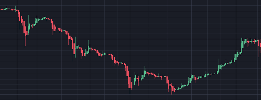 Heikin-Ashi candlesticks. More trendy.
And now, the bubbles…
June 2011 bubble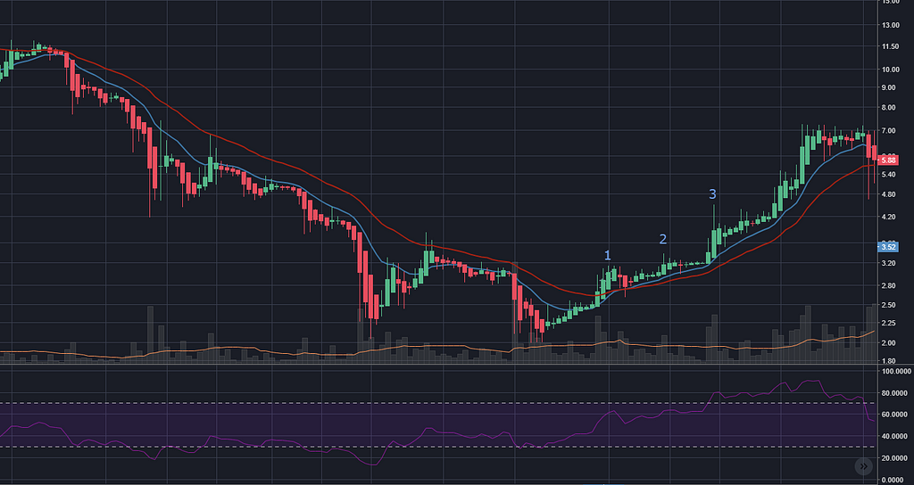
By the looks of it, the best indicator that the downtrend after a bubble has run its course is the appearance of a higher high.
For the back end of the 2011 bubble, I should have seen point 1 and thought OK, that was a pretty good reversal, but so was the one a month ago, and two months before that. Then I would have/should have kept my eye out for the price making another little spike that was higher than point 1. Which it did 10 days later.
If I’d wanted to be more cautious, I could have waited for point 3 to buy back my bitcoins. By this point the RSI would have climbed above that 70% mark.
I should mention, I’m completely ignoring the general rules of the RSI, I’m just pointing out what I see.
By this time point 3 rolled around, the price had already climbed 100% (!) from the low.
I think that’s the eternal trade off of trading, right?
I think for my grand career as a trader, I’ll start out happy to miss the tippy tops and the deep trenches and instead make more confident trades. Then as I become a hotshot, I’ll aim to refine my entry and exit points and get as close to the turnaround points as possible.
Also I can see that between points 1 and 2, the blue line (12 day EMA) moved above the red line (26 day EMA), signally that the downtrend had ended.
April 2013 bubble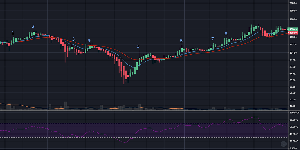
Hmm, this shows two higher-highs (1–2 and 3–4) that didn’t signal the reversal of the trend. There’s also the crossing of the EMA streams (blue moving above red) that gave a fake signal at point 1.
In looking for differences between 1–2, 3–4 and 5–6, I don’t see anything. None of the higher-highs were higher than the previous high (does that makes sense). In fact, I’d need to wait for point 8 before I could say the price had moved above a previous high (the one at 4).
I might also say that even though from point 5 to 6 was a higher high, the price kept stomping all over the EMAs. But by the time point 7 came around, the price had ‘tested’ the 12-day EMA and stayed above it.
I guess at point 6 the RSI was rubbing up against the 70% marker, we’ll see if that’s a consistently useful thing.
In reality, being cautious I would have bought back in at point 8 — as much as it’s possible to tell what Past David really would have done.
November 2013 bubble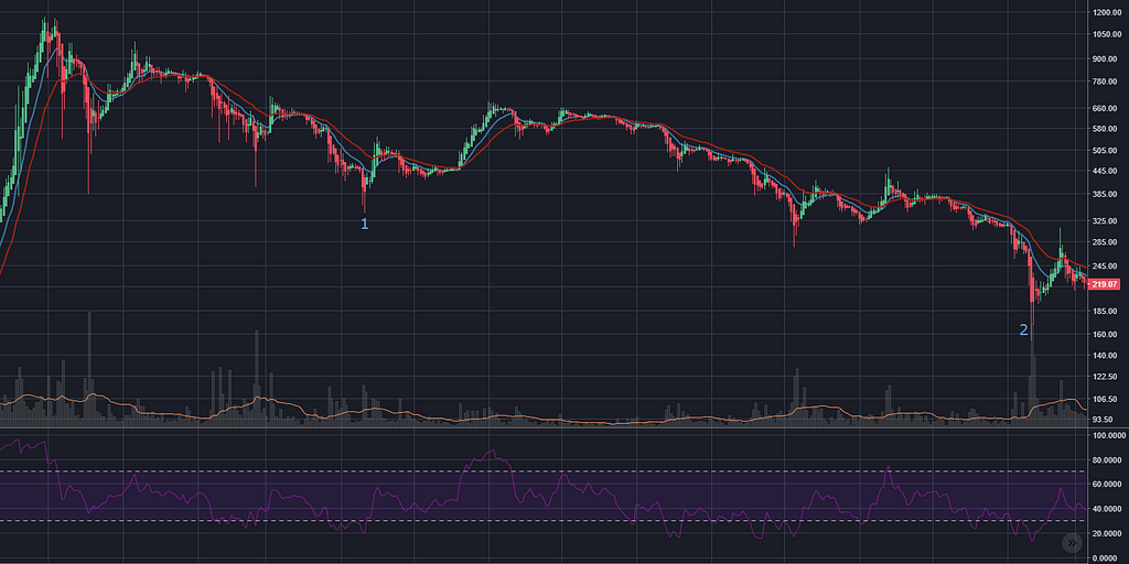
This is a tricky one. I could describe this in one of two ways:
- The bubble burst in November 2013 at $1,000 and then over the next 4 months dropped back to $400 (point 1). In an unrelated move, the price then picked up for the next two months before entering a downtrend for 7 months, bottoming out at $200.
- The bubble burst in November 2013 at $1,000, then tumbled for a year and a bit all the way back to $200 (point 2).
I think to classify it as either definitively doesn’t really help me, so I’m going to take a squiz at both bottoms/reversals.
 First bottom, four months after the peak. Yes, I moved the 1.
Point 1 is like a textbook move for volume drying up, EMAs crossing, RSI heading above 70% and also — not shown — Bollinger bands doing a ‘Squeeze’.
(Of course it shouldn’t be super-surprising that all these lagging indicators show the same signal, they’re all just summaries of stuff that happened over the last few weeks.)
Maybe the savvy chartist would say that the price has moved above the last high (marked with a white line), and the squeeze just happened, and the RSI is above 70% and the blue EMA went above the red. And all on some very above average volume.
What I haven’t done (yet) is to go back through the chart and found all the instances where these indicators aligned and then nothing happened.
Anyhoo, it could have been a bad buy since the price proceeded to do not much for three months, then went and dropped its pants 50% of the way down.
OK, moving on to that very low low of $200 (I was rounding numbers, actually it took a quick dip to $150 on the day).
This, I feel, is even more out of my league — I think spotting similarities between past peaks is not so hard (with the training wheels of hindsight), and spotting the reversals of clear downtrends into clear uptrends is only marginally harder. But spotting the end of a long, uncertain downtrend, which then turns into a no-trend/sideways movement for a few months, is way above my pay grade.
 Off to the right: many months of meandering
In fact the only thing that stands out to me on this long dive is the 1–2 higher high that turned out to signal absolutely nothing. It’s got good volume, EMAs crossing, RSI going over 70%, but still it just did the graphical equivalent of a sad trombone.
Maybe I need some more tools in my tool belt. Maybe there was bad news in the news. Maybe it’s all just random.
(Or maybe it’s Maybelline.)
November 2015 bubble
I’m more and more inclined to not even call this one a bubble. It was less than a 100% climb, and afterwards the price ‘only’ dropped 33%, with the price dipping below $300 for the last time (hopefully ever).
I don’t see any clear ‘sell’ or ‘buy’ signals here, so I’m just going to point out the pattern at point 1 where the candlesticks are short, the EMA lines come together, volume drops, then POW, the price runs away, staying above the blue line for a decent little climb.
I’m going to call it the calm before the storm pattern, despite the fact that it probably already has another name.
June 2016 bubble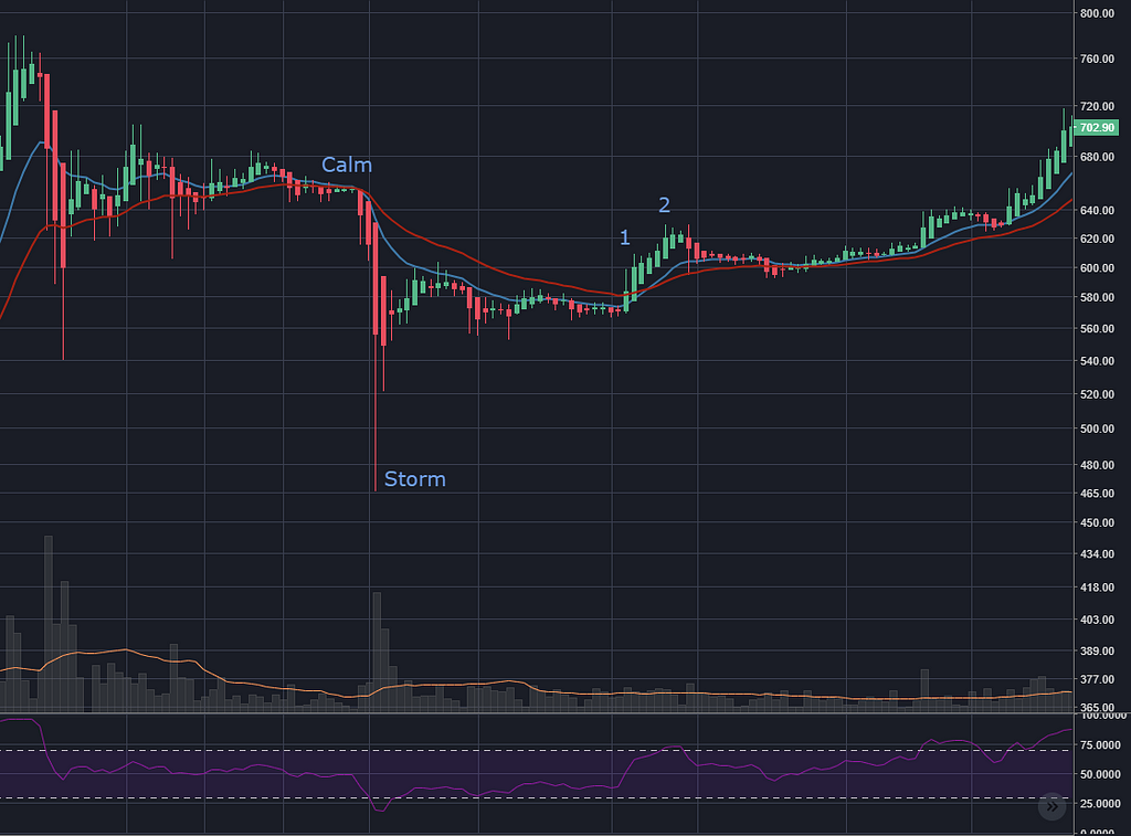
Hey there’s that ‘calm before the storm’ pattern that I’m famous for being the first to name.
Anyhoo, this is the other bubble that is barely a bubble, now that I’ve spent more time staring at it (oh I should have said analysing it, that would have sounded smarter).
Point 1 is the first higher high after that big dip, but I think the more cautious buy point would be point 2. It’s another higher high, with the EMAs crossing and the RSI above 70%.
This is all pleasingly repetitive. I hope you’re not getting too bored; this blog post has kind of become a bit of a scrapbook for me. And if you are bored, why on earth are you still reading? You really need to get your priorities sorted.
December 2017 bubble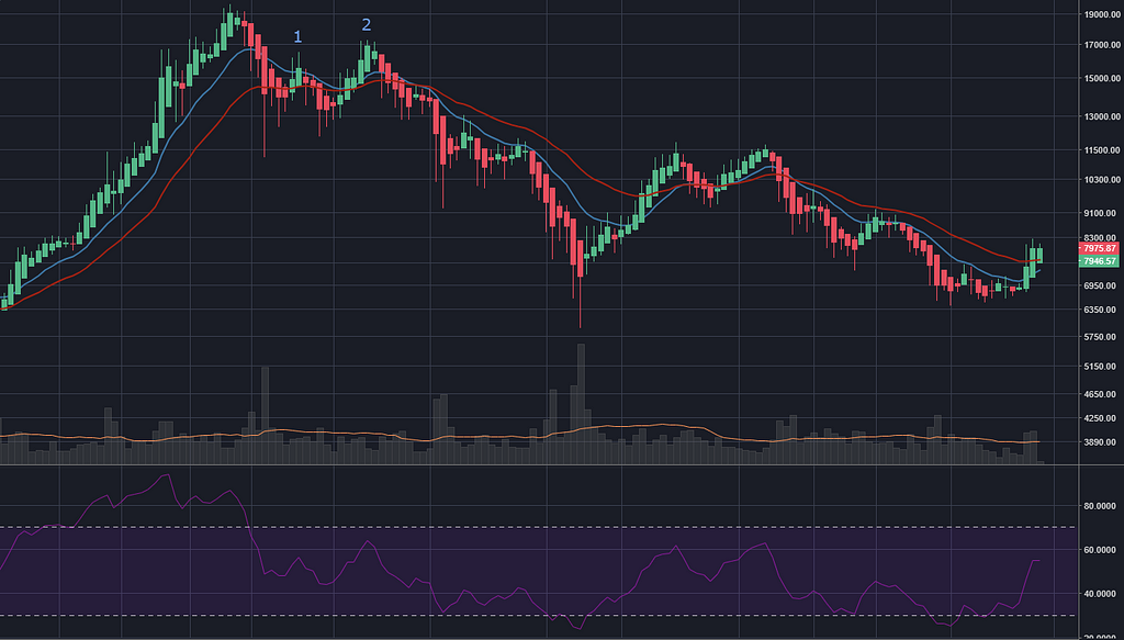 The only one that matters (as at mid April 2018)
In my professional, expert, distinguished opinion, this downtrend is not over. Part of me says “yeah, but it’s already dropped quite a lot, if I want to chuck in a thousand bucks to leave in for a decade, it doesn’t matter that it’s not right at the bottom, does it?”
Then another part of me zooms out and wonders, would it be so surprising if the price now dropped to that white line?
No, not really, it’s kind of headed in that direction. And because log scales are weird, that white line is half the current price. So instead of investing $1,000, it would be more like $500 before things even warmed up.
Since I don’t feel like losing half my money (or half of anything that I like having) I’m going to wait a little bit.
(For the record, I’m also not confident that this downtrend has much steam left in it, so I won’t be ‘shorting’, either.)
So anyway, that was my week. I look forward to going back over all this as I learn more, to see what stupid things I’ve said today, and what obvious signals I missed due to lack of technical knowledge.
On a different note, these blog posts are super time consuming (this one was about 20 hours), but I’m really glad that I’m doing them. I’ve written and re-written so much this week, and spent so much time doing the chart screenshots and spreadsheets and organising my thoughts. It’s forced me to consider things more thoroughly than I would have if I wasn’t going to be sharing it with the world.
So thanks for existing, world. You’re all great!
Wrapping up
I got sidetracked this week, shifting focus from the short term trading to the mid-to-long term. It seems to me that (if past performance is indicative of future results) buying and holding bitcoin for a decade is within my appetite for risk, and that making an attempt to avoid the worst of the crash after a bubble might be within my grasp.
Next week
I have an idea for a chart I want to make that plots all the altcoins from their launch to the current day. I’m curious to see how many of them tank vs grow enormously. I’ve already built a prototype:
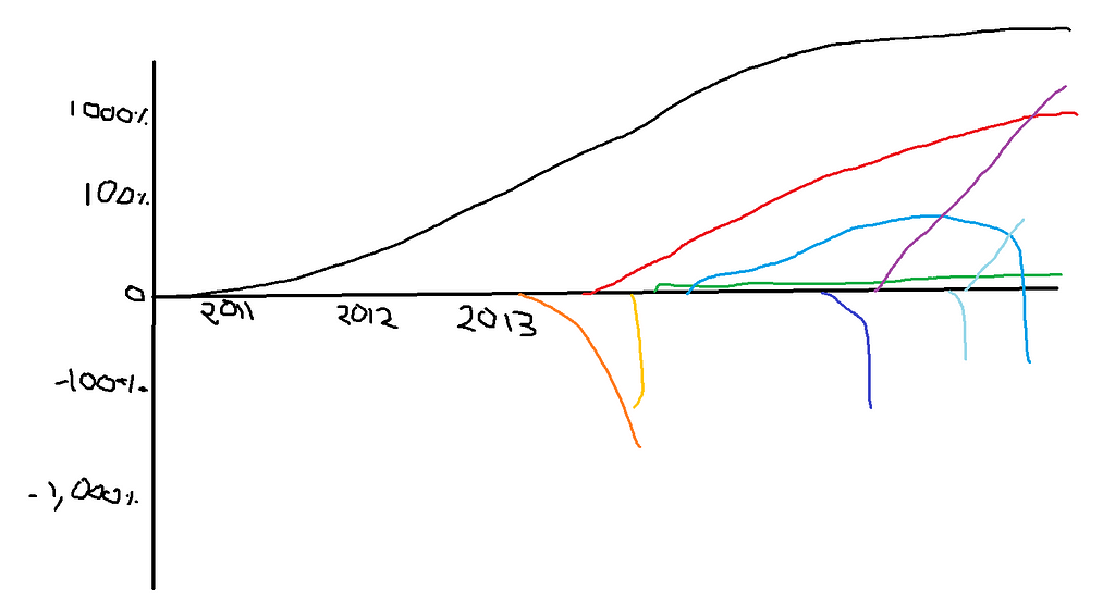 Not drawn: thousands of other altcoins
But I don’t want to get too sidetracked from technical analysis before I’ve even finished one book on the topic. I need to be ready for that fertile playground (gross) of the next bitcoin uptrend. So we’ll see if I can resist the urge. CHARTS!
Thanks for reading, and hey thanks to everyone who’s shared interesting links/books/podcasts/tax-tips in the comments, it’s much appreciated!

A crypto-trader’s diary — week 3 was originally published in Hacker Noon on Medium, where people are continuing the conversation by highlighting and responding to this story.
Publication date
Disclaimer
The views and opinions expressed in this article are solely those of the authors and do not reflect the views of Bitcoin Insider. Every investment and trading move involves risk - this is especially true for cryptocurrencies given their volatility. We strongly advise our readers to conduct their own research when making a decision.