Latest news about Bitcoin and all cryptocurrencies. Your daily crypto news habit.
Why An Ugly Website Could Outperform Yours
How your business could benefit from an ‘ugly’ website Is Your Website ‘Ugly’?
“Just don’t make it ugly,” someone said to me once.
It’s funny that good design is usually perceived to be something that is beautiful, which — sure — in some cases may be true, or needed.
But design is usually about so much more than that.
There are some great examples of less than appealing websites that come to mind when someone mentions the word ‘ugly’. Below are some screenshots of a few examples of websites that may be deemed this way. I’ve tried to include more than the simple text ones, looking to e-commerce sites as well.
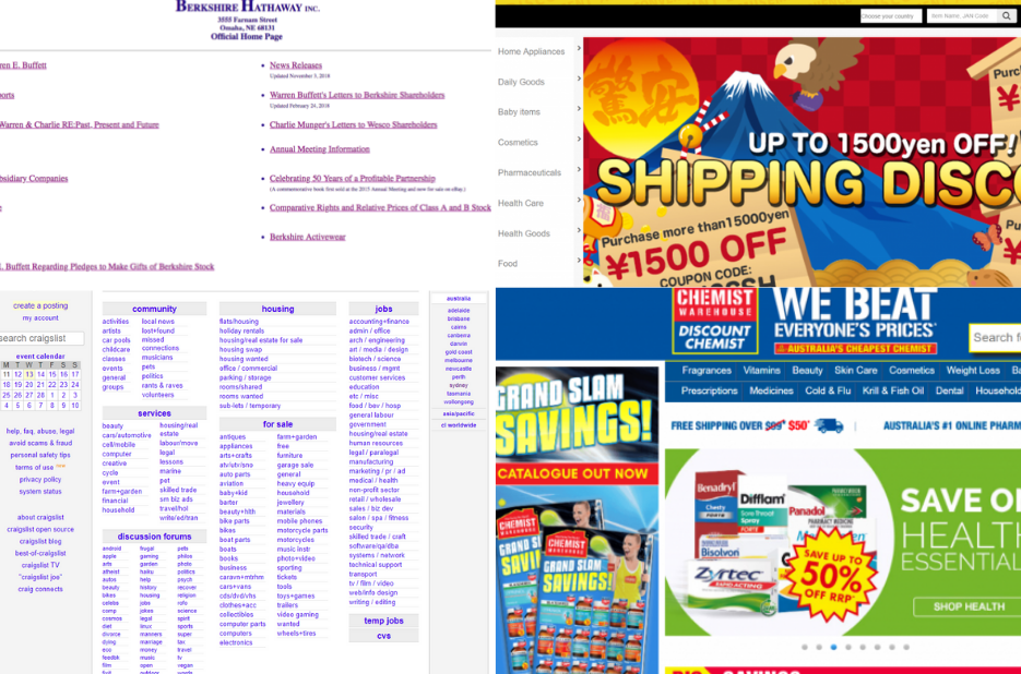 A collection of ‘ugly’ websites. From Top to bottom left: Berkshire Hathaway, Don Quijote, Craigslist and Chemist Warehouse
Without knowing these brands, at first glance, they do appear quite unsightly.
It probably isn’t going to surprise you that all of these websites are the leaders in their space and turn over millions to billions of revenue every year.
Don Quijote and Chemist Warehouse are both discount stores, Craigslist is a classified advertisements website and Berkshire Hathaway is a multinational conglomerate owned by infamous Warren Buffet.
So why are these websites aesthetically lacking?
Don Quijote and Chemist Warehouse both have very clear and similar distinctive features. They both have quite a quirky, colorful design scheme, and things seem to be splattered all over the place.
Craigslist on the other end goes for a very simple look without real imagery or color, just links.
Berkshire Hathway follows suit, but focuses on providing information that is necessary to their stakeholders.
Each has its own way of representing one essential factor and that is the value proposition.
Site Design that Communicates Value Propositions
The value proposition for Don Quijote and Chemist Warehouse are, of course, their heavily discounted prices.
By understanding their target market, their design focuses on delivering more quirky text, colors, and splash.
Our perception of these discount stores can be summed up in a variety of words and phrases: cheap, bargains, discounts, etc.
Spinning it the other way, if Louis Vuitton had a website that looked like any of these, the perception of the brand would deteriorate. There is a reason why all luxury brands look premium!
However, both are happy to look and be recognized this way as they are targetting exactly these people. They are looking at selling more at cheaper prices and so by looking less fancy, consumers immediately perceive the website to be cheaper and in some cases could be eliminating uncertainty.
It’s the value they are providing and what they are delivering that makes it the most important factor as highlighted by CrazyEgg (Neil Patel).
This is why understanding your target audience is essential.
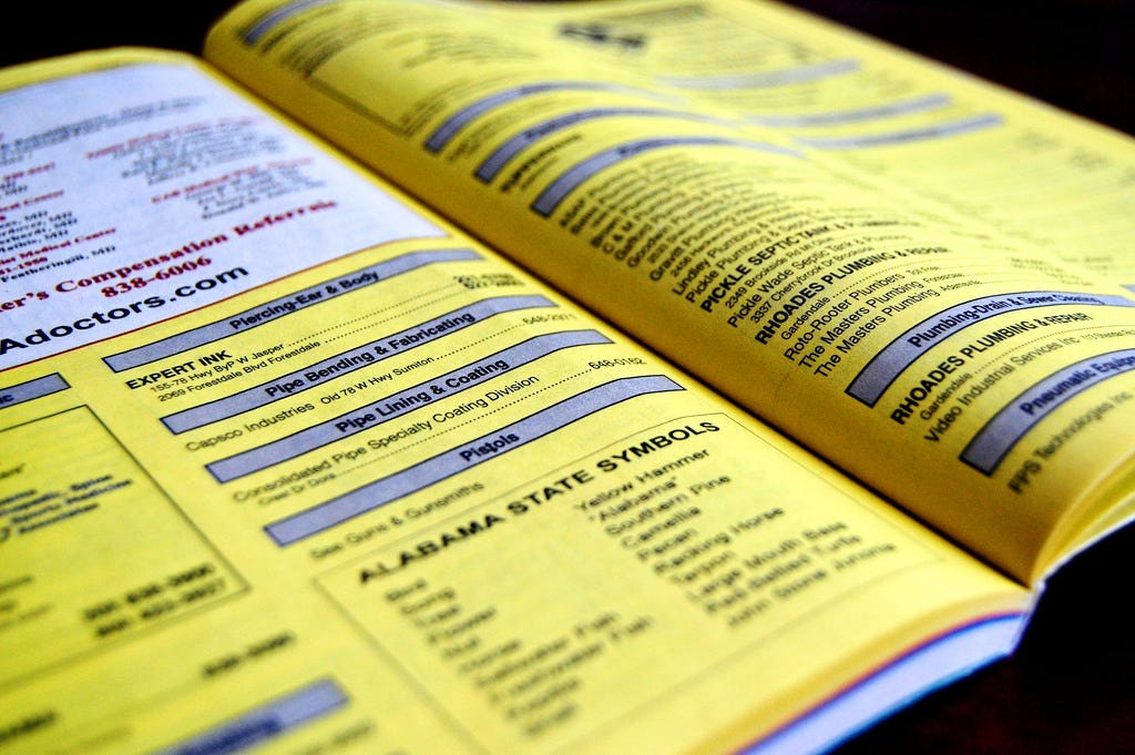
Craigslist goes about it the other way but still focuses on the value proposition.
 Reference: https://www.flickr.com/photos/allergictowork/26387486391
Like the Yellow Pages, by offering simple but clear advertisements, this is exactly what users expect and seek.
By not overcomplicating it, it delivers a clear value proposition without any distractions and focuses on what matters.
Finally, the infamous Berkshire Hathaway’s website is probably the one you were not expecting.
Looking like something in the 90s, it sticks to an ethos of simplicity rather than over complicating their pages with anything fancy. This is because their website focuses on one goal and that is fulfilling the legal requirement of publishing specific documents that are required by the company to release to the general public (shareholder letters, annual reports etc).
Thus, keeping things simple and straightforward is all they need to do.
What’s the Takeaway?
These examples — from e-commerce to your big investment bodies — all have one thing in common. They are crystal clear around their value proposition, which ultimately funnels into an overarching goal.
The main question you need to ask yourself is: What is most important for your visitors to see, or, what is your value proposition?
Your design should meet these expectations — and it shouldn’t matter if it's ‘ugly’ or beautiful — as long as you’re meeting those requirements.
Maybe, in fact, your business could benefit from making its website ‘ugly’?
Why An Ugly Website Could OutPerform Yours was originally published in Hacker Noon on Medium, where people are continuing the conversation by highlighting and responding to this story.
Publication date
Disclaimer
The views and opinions expressed in this article are solely those of the authors and do not reflect the views of Bitcoin Insider. Every investment and trading move involves risk - this is especially true for cryptocurrencies given their volatility. We strongly advise our readers to conduct their own research when making a decision.