Latest news about Bitcoin and all cryptocurrencies. Your daily crypto news habit.
 Photo by chuttersnap on Unsplash
Listing screens: everybody uses them and nobody thinks too much about them. In my time, I have seen all variations of listing screens from monstrous to minimalist. This post distills some common problems, solutions to them and ideas to help make them effective. Here is what you will get if you read this post:
- Introduction
- Organising Data
- Pagination and sorting
- Optimising Data Readability
- Designing Effective Search & Filtering
- Granular vs. Overview list pages
- Performance
- Redirections to & from list pages
What are list pages?
List pages as the name states list out data for the user. Let us look at some examples from both Enterprise and Consumer worlds:
Consumer examples
- Amazon — The page that lists products when you type in something to search.
- Gmail — Landing page that lists out all your emails
- Pinterest — Tiles showing images
Enterprise examples
- List of trucks in a logistics management software
- List of employees in an HR management system
- List of customers in a CRM software
- List of Invoices in an accounting software etc.Key elements
The key elements of a list page are:
Data — The main thing your page is listing. This could be rows or tiles or cards of data.
Filters — Filters help the user find what they are looking for. These could be in-line filters or Filter panels or a generic search.
Actions — These could be buttons or operations in a menu. An action is something specific the user does to an item or items in a list. Ex: Archiving mails, Processing Payments on a list of invoices, Mark goods as received against trucks etc.
Organising Data in List pages
One of the critical challenges with list pages is, they become bulky over time. Users start struggling to find what they need and developers start struggling with performance. Let us understand the user’s struggle first.
A simple relatable example is your Gmail Inbox. Imagine if your inbox didn’t have tabs or a search bar, you have a list of emails going back to the first day. This immediately creates a few requirements:
The need to break the list into manageable chunks: Let’s assume that a user has 1000 mails in his/her inbox. If all 1000 have to be fetched at once and shown, it would cause two problems:
- The screen can show only about 20 records once without the user scrolling down.
- If the mails were NOT sorted i.e. appeared in random order — New mails could be anywhere. There is a risk that the user would miss a mail.
These two problems can be translated into two product features:
Pagination — Pagination is the process by which data is broken across web pages. This solves one major issue — Queries don’t have to fetch anything more than what the user will see on the first page. That means the list can load 20 items at a time thereby reducing the load time for the user. The next set of records load, when the user scrolls down or clicks on next.
Sorting — Even with pagination, if the mails were NOT sorted, there is a chance that a new mail would be on page 7 instead of 1. This means there is no way the user would know where it is. This forces the user to go through several if not all pages to find new mails. If we sort by received date so that the latest mails appeared on the top, new mails will always appear first.
Problems with pagination and sorting
I have seen systems implementing pagination and sorting incorrectly. Consider that systems need to allow the user to sort based on their requirements. A classic example is, e-commerce sites that allow you to sort by price or popularity or relevance. Pagination fetches the first 20 products sorted by relevance to the search term. Now the user wants to sort the list by price — low to high. This sorting has to be applied to the entire result set and NOT on the 20 products displayed.
Product Manager Tip: Optimise the default sort by looking at the usage data. If the user is always overriding the default sort, change it. The goal is to reduce unnecessary server calls and keep the user happy.
Look the sorting pattern that is most used and set that as a default. This would the crudest way to do it. A more precise way would be to create cohorts and figure out which cohort prefers what sorting order. Set the order at the user level based on the cohort he/she belongs to.
There are several Pagination and sorting patterns with their own pros & cons. I’ll cover those in another post. Remember, if you are designing or building a listing page always keep volumes in mind. Always know the answer to the question:
How many records does the user have to see to do the job efficiently?
Data Management
The single-most critical feature of a list page is readability. As time goes by, the data piles up to a point where sorting and filtering are no longer viable solutions. The user needs better solutions to make the data manageable.
Let’s go back to that Gmail inbox example for a second. If you assume that an average person receives 20 new emails a day, in a year that is 720 mails and in 3 years that is 2160 emails. If assume that emails from the last month are the most relevant, that is still 30 pages @ 20 emails per page. This is where segregation comes in. Now let’s say I segregate emails into Promotions, Social & Primary. This makes all the difference. Now I have 3 tabs & a total of 60 emails that are accessible. Even better, I know I need to focus on the Primary. Even though a search bar is a great aid, it is best not used unless there is no alternative to find an email. In fact, I should only use the search bar if I can’t find what I am looking for in the first page.
Status-based segregation works really well for enterprise and transaction systems. Let’s look at a few examples:
- List of candidates in an applicant tracking system — List page segregated into tabs based on their status in the pipeline: Phone round, Technical interview, Manager Round, Offered
- List of trucks in a transport management system — List page segregated into tabs based on their status: In-transit, Loading, Delivered
- List of Invoices in an accounting system- List page segregated into tabs based on their payment status: Unpaid, Paid, Overdue OR based on category: Receivables, Payables
Google’s solution to the Gmail problem was an ingenious one. Their tabs are categorisations done through machine learning.
Note: Tabs can become useless if the statuses you are dealing with are more than 5. You don’t want the user to have to scroll to find the relevant tab, accessibility is the key. If you are dealing with an application that needs to be served on mobiles, you may need to consider tabs more carefully. Or replace them for a different design paradigm.
Visual Hierarchy
This delves into the world of design. It comes down to how quickly the user is able to spot what he/she wants. The data must be so well differentiated that the spotting happens without realising it. To understand visual hierarchy, grab a newspaper and observe the different sections.
- Headings in Bold and larger fonts
- Highlights in quotes & italics that call out attention to themselves
- Content in smaller font
- Paragraphs etc.

If you look at the two examples shown above, adjusting text size and weight enhances readability. Most of the enterprise listing screens I have worked with in the past had no such hierarchy. There are two reasons for that:
- Stakeholders with different motivations used the same list page.
- The records are rows & columns.
I’ll dig deeper on both issues later.
For any listing that carries a lot of data, making the records identifiable is a must. This is hard work and requires a deeper understanding of what each user does on the screen.
This may seem obvious but most people would rather skip this aspect and provide the data to the user. They let the user figure out how to use it.
The search bar
Search bars are useful on list pages but there are things to watch out & account for.
- The search has to be generic — No matter what the user types, the search should return the results. It has to perform a wildcard search across columns.
- The reason why a record was returned should be discoverable. This means if I entered a keyword to search for when I see the results returned- the reason why that record was found must be obvious. This is usually achieved through highlighting for modern list pages that list records as cards or tiles.
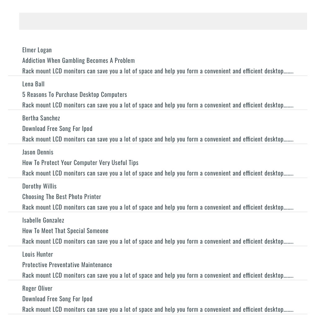
 Unclear Search Results
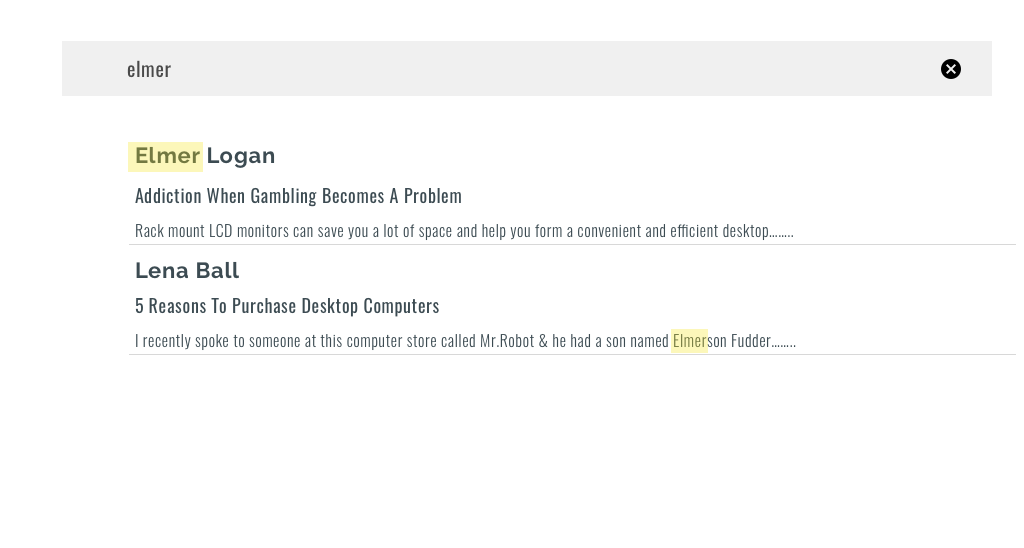 Highlighted Search results
In the example above, the first image shows two search results. It is not very obvious why the second result was returned. With highlighting, this becomes obvious. This is not so easy to do when the list page is a flat table structure — I’ll tackle this in the next point.
If the data on the list page is huge, say each row contains 15 fields, it is very hard to understand the reason why a record was returned. This should be done using a different design paradigm. In a normal scenario, the search returns a list that looks exactly like the list page only fewer records. If there were 10 records to start with, the search returns 2 rows but the way the list appeared hasn’t changed. Look at the example above.
Now, look at the example below which shows the list page before and after the search.
 List page with 15 columns before search
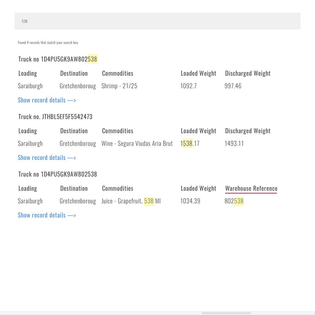 Search results on List page
As seen in the mock-up above, the search results are displayed to the user in a style that allows them to digest the data and drill down further. I have underlined the field in red to show that the columns shown can be context specific.
Searching in multiple fields
I often see users who want to search for values in specific fields. For example, in the screenshot above, the user wants to search for “538” in warehouse receipt numbers or truck numbers only. This becomes a problem because the feature works as a wildcard search on the entire fieldset. One way of solving this is to allow users can use certain types of keywords to search for specific information. For example, Gmail allows “from:sheshank” as a search key which will fetch all emails received from Sheshank.
Another Tip: If the search key has multiple strings, split the search key by any delimiters and perform a wildcard on each string. For example, if the search key = “wild card”, the system should split it as “wild” & “card” and search for both in the underlying data set.
Note: These features are usually not discoverable so if your target audience is not very tech savvy, the feature will never get used.
I can think of several other missteps that one can take while implementing search but that warrants a post by itself. Moving on…
Overview of data vs. granular data
This one is very specific to enterprise products. Often, listing screens are where users spend most of their time. They initiate transactions or follow-up actions from the listing page. This being the case, users often need a lot of information about the transaction so that they can filter and find data. If two different stakeholders use the same list page with different motives, the page design can become very complex. The details that each stakeholder wants to see before taking the next step is different. Let us take an example:
Logistics company ABC has two departments that need to look at trucking information:
- Transport planning department — Needs to look at a list which they can use to identify the status of trucks, what they are carrying, what was the loaded weight, where is the destination and a host of other information.
- Accounts department — Needs to look at a list of trucks that need to be invoiced to the customer. They need to see the customer names, the route, and the product.
Before we attack this scenario, I will explain another related concept. How much does the user need to see before clicking & why?
Well, it depends on who is clicking. Going back to the truck example, the logistics guy may need to see a whole lot of information to plan his next move whereas the accounts team needs to see a limited set of things.
It all comes down to user research. In most cases, we build one listing that fits all purposes. This leads to a situation where no stakeholder is happy.
So why is this a problem? Most transaction based systems use relational databases that store data in tables, there are several tables that are affected in one transaction in a parent-child relationship.
For example, A truck can carry multiple commodities between multiple destinations. If you assume that you need to capture locations and weights at both loading and discharge locations you have already created at least one set of parent & child tables. In order to query any record, you have multiple joins which eventually bog down performance. Ultimately, performance tuning on queries and indexing takes you only so far. The system will slow down and become painful to use.
Now let’s link this to our original issue. There are two stakeholder teams using the same listing — one needs granular information about the transaction and other needs high-level information. Granular information means more joins in traditional RDBMS systems. Performance of the listing degrades as time goes by. To improve performance the product will have to take calls to drop information from the listing that slows it down. This will impede the logistics user from making decisions. If you don’t do it, the accounts department will find it slow and raising invoices will become a pain.
The solution is clear, don’t mix concerns and build a one screen fits all listing.
Nobody can predict how things will pan out in the future. Design in a way that each listing can mature for its own stakeholder.
Sometimes you will have many stakeholders within the same team who need different types of information. Go ahead and build separate overview and granular info listings. As far as performance goes, make sure your developer knows from day 1 that this could be an issue. They can implement appropriate solutions like creating views, caches, writing stored procedures to populate flattened tables from the underlying joins, partitioning tables, archival, etc. Technology has evolved so developers have a plethora of techniques like caching to tools like Elastic & Algolia to solve search & list issues.To summarise:
- Don’t try to build a single listing that displays both granular as well as overview information.
- Don’t mix stakeholder concerns & build a one size fits all listing.
- Analyze volumes & have conversations with developers about listing and search at the beginning.
Redirections from & to List pages
This is another neglected aspect of user experience for list pages. It is mostly a result of not thinking through flows from the start to the end. I am going to explain this issue through two examples.
Issue 1: Redirections to appropriate list page after completion of an action
Imagine you are on gmail, you compose a new mail and send it out, upon successful completion gmail takes you to sent items instead of keeping you on the inbox. Taking the user to the sent items could be a way of confirming that the mail has actually been sent. In reality, users don’t work this way, they want to continue reading or responding to mails. So the right way to do it would be to keep them on the inbox with a confirmation toast about the email’s status.
In case of gmail — the paradigm is clear, the user must stay on the inbox but for other applications this may not be the case. Take for example an e-commerce site, the starting point is a list of products and the transaction ends with a sale. If the system navigated the user to the product list upon completion it would make no sense. In enterprise applications, this becomes very complex. There are several follow-up transactions that can happen on an originating one. Depending on if the follow up action is immediate and/or done by same person , the redirection design changes.
Rule: Do NOT redirect the user to a location different from the origin of the transaction unless there is a strong reason to do so.
Issue 2: Retaining the filters upon completion of transactions
Imagine you are on gmail, you search for “UX best practices” and get 15 mails. You click on the 3rd mail because it could be the one you were looking for but it wasn’t the one, so you hit on back. Now you lost what you searched for and need to key in your search terms again. Luckily, gmail doesn’t pose this problem but a lot of enterprise applications do. Often users will key in filter criteria and the system will return a set of records, the user opens one of them and when he/she goes back — the filter criteria is lost. The irritation that this causes to the user is very high. Especially when it is happening on a listing where they are transacting all day.
Rule: Always retain search filters for cases where the user is expected to return to the list page after viewing some details.
Note: This needs to be mentioned to your engineering team upfront so that they can design the systems to do this.
So there you have it, a guide to building list pages based on a lot of mistakes I have seen and made(sadly).
If you enjoyed reading this, you can read my similar posts on other topics:
- How to design roles & access controls
- How to design kick-ass user registration flows
How to Design and Build Great Listing Screens for Your Product was originally published in Hacker Noon on Medium, where people are continuing the conversation by highlighting and responding to this story.
Publication date
Disclaimer
The views and opinions expressed in this article are solely those of the authors and do not reflect the views of Bitcoin Insider. Every investment and trading move involves risk - this is especially true for cryptocurrencies given their volatility. We strongly advise our readers to conduct their own research when making a decision.