Latest news about Bitcoin and all cryptocurrencies. Your daily crypto news habit.
An Introduction to Design Systems
If you’ve been reading much in the design world lately, you probably know that design systems are all the rage. If you’re not a designer but curious about what everyone is talking about, welcome! 👋 This is for you too. 😃 I thought it would be helpful to share what design systems are, why they’re useful, and a few tips for effective systems. But before we can talk about systems, we need to talk about patterns.
Design Patterns
Design is often thought of in terms of aesthetic. Color palettes, spacing, and typography come to mind. But design is much broader than that. It informs behavior and functionality as well. Design shapes how users move through a checkout process and reset their passwords. It helps users understand whether a message was sent successfully, or which direction to swipe to see more content. Design also influences and application’s voice and tone. Perhaps your weather app is personable and playful, like Poncho. Or maybe it’s precise and beautiful, like Dark Sky.
Because of this larger context, many designers have opted to use the term “design patterns” to describe the way design influences how a user experiences an application. Well-designed patterns often employ nuanced and nearly-imperceptible details to create consistency and uniformity. In fact, if you have excellent design patterns, your users will likely not notice them at all. The buzzword for this “intuitive design.”
Communication Breakdown
Getting these patterns right takes a tremendous amount of effort and iteration, and effective documentation is perhaps even more of an undertaking. Beyond that, ensuring that your designers’ intentions are accurately translated into production is incredibly challenging. And while design tools have come a long way in the past few years, they still have a long way to go.
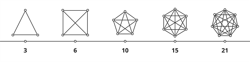 team communication diagram
The problem becomes compounded as your team grows. You’ve probably seen a similar diagram before. I like this visual for describing how the complexity of team communication grows with size. A small team of three to four people has at most six lines of communication, a fairly manageable number. But as your team grows to five people you nearly double that effort with ten lines of communication. Add two more people and the problem increases to twenty-one lines for only seven people. Depending on where you work, that might sound like a large team, but when you start adding project managers, designers, developers, and QA, you can reach that number easily. Communication quickly becomes a complex issue, and keeping everyone on the same page requires constant effort. There are a lot of opportunities for any one person to be out of sync or miss an important detail. This is where design systems are valuable.
Design Systems
Wait, Don’t You Mean Style Guide?
A point of clarification is probably needed. Design systems, pattern libraries, and style guides are all popular terms, and depending on who you ask, could be interchangeable or very different things. It seems the current trend is to have style guides and design systems live together which further blurs the lines between them. How you decide to define them is up to you. In this article, I’ll refer to design systems and style guides as two separate things (though a style guide is certainly a part of a design system). Against my better judgment, I’m going to make a distinction that style guides are a portion of a design system. Their focus is on describing the rules and principles that guide the system. If you’d like to see some examples, Brad Frost has a great list here.
While design systems are certainly concerned with communicating its guiding rules and principles, they also involve the implementation of that system. Depending on how the system is structured, this might be a component library, or it could be a collection of CSS style sheets. Either way, it provides a mechanism to implement the principles of the design system. If you’d like to see some good examples, UX Pin has a list here.
Intent & Implementation
Design systems are a means to describe design intent and implementation, and both are equally important. Intentions without implementation are irrelevant, and implementation without proper intention will be inconsistent. This dual nature produces an interesting quality. Systems are not strict dogma etched in stone. Rather they are living documentation. The system grows and iterates with the application. Its rules are expanded, modified, and rewritten as needed. They are, at the same time, a representation of what the application is and what it strives to be.
Again, the goal is communication. We want our system to provide enough support to bridge the complexities of communicating design intentions to everyone on the team. If our system is doing its job well, it should be enabling designers and developers to effectively translate design principles into our application(s).
What Makes a Good Design System?
This topic definitely deserves its own post, but I’ll briefly highlight some important aspects of our design system.
Consistency Is Baked-In
Your design principles should be clear, but it shouldn’t be essential for a developer to have a perfect map of the design rules in their mind to build a component, or for a QA tester to verify it. Baking-in consistency means creating highly reusable bits of code (whether CSS styles or reusable components) that handle a lot of the minor details. You’ll know you’re getting it right when you start getting consistent style and behavior “for free.”
Make Mistakes Difficult
This is something our team learned the hard way. At first, we wanted our implementation to be highly extensible, but providing too many options led to confusion and ultimately issues that made it to production. Because the right choices weren’t clear, the errors were non-obvious in code review and were expensive to untangle down the road. We retooled our implementation to provide few, clear options. At first this felt very restrictive, but ultimately it led to a high degree of freedom for our developers. We made the right choices easy and removed opportunities for mistakes. And when errors are made, they‘re easier to catch in code review.
Encourage Collaboration Between Designers & Developers
I’ve worked on several teams where our process involved a “design hand-off.” This usually meant that design added enough content to the mockups for the developers to implement them. This almost always ended poorly, despite well-intentioned designers and developers. Unfortunately, mockups only communicate a tiny percentage of the intended design. Our development team has an open dialog with our designers to clarify details and ask questions. This communication helps us develop our common design language, and it influences how our documentation and tickets are written.
Thanks For Reading!
I hope you enjoyed this article! Developing an effective design system has been one of the most beneficial things for our team. I hope there were some helpful ideas for you and your team as well.
You can find me on Twitter and GitHub. If you enjoyed this, you should also subscribe to my newsletter!
Communicating Design Patterns was originally published in Hacker Noon on Medium, where people are continuing the conversation by highlighting and responding to this story.
Publication date
Disclaimer
The views and opinions expressed in this article are solely those of the authors and do not reflect the views of Bitcoin Insider. Every investment and trading move involves risk - this is especially true for cryptocurrencies given their volatility. We strongly advise our readers to conduct their own research when making a decision.