Latest news about Bitcoin and all cryptocurrencies. Your daily crypto news habit.
How to write an iOS, Android, and web app simultaneously while managing a design system (and throwing in some virtual reality fun for good measure).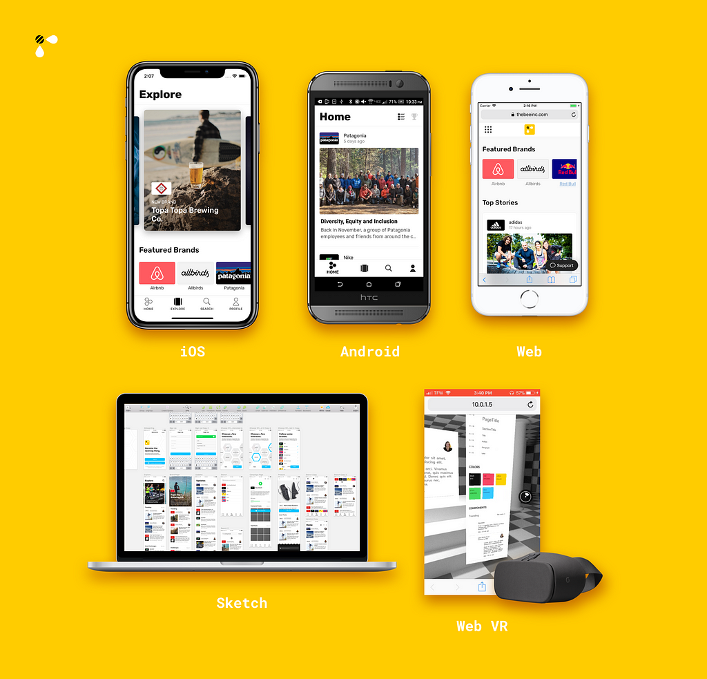
Imagine this: You’re an engineer at a small startup. You’re in charge of both designing and developing the front-end user interface for your product. And your product relies on being available to everyone on every device as part of its value prop. How are you supposed to build a platform with so many targets?
The Bee App
The Bee App is a digital VIP pass for your favorite brands. It allows brands to deliver stories, host contests, and release exclusive products directly to their top tier fans (think the Nike app for every brand).
Regardless of how a user accessed Bee, our team wanted to provide the best experience possible. This meant we couldn’t think of this as simply an app, but rather as a platform: any device, anytime, anywhere. The overhead for building so much with a small team (me + one other server-side engineer) was daunting, but as the mobile ecosystem has matured, so have the tools. We decided to create a library of cross-platform, reusable components in order to meet our goal of building synoptic web, iOS, and Android apps.
By using universally renderable components, we were able to build three apps simultaneously while managing a design system.
From concept to creation, we shipped The Bee App for iOS, Android and web simultaneously in less than 4 months. The only way to achieve this was by creating user interface components that were reusable across web, iOS, and Android. We call this our Universal Component Library. Here’s what we learned while building it.
How to Build a Universal Component Library
First, we decided to use React as the framework to power our user interfaces. React allows you to define a user interface as a function of the data that it is provided with. What this means is that you can build UI declaratively—not imperatively.
Furthermore, React allows the definition of the user interface to be decoupled from the rendering engine that puts it on the screen. This is the feature we wanted to take advantage of.
 We love React
React isn’t a write once, run anywhere kind of framework. Keeping the different flavors: React-Native, React-VR, etc. separate has been a very conscious decision by the React community.
However, people in the community have noticed that certain implementations of React have similarities. For instance, <div> in React-Dom and <View> in React-Native serve similar purposes as containers. Same with <img> and <Image>. This got the React community thinking: what if there were a common interface for these similar components?
Well, some very talented and creative engineers at Airbnb created one called React-Primitives. React-Primitives represents the most commonly used subset of components in React and React Native, namely: View, Image, Text, StyleSheet, Animated, and Touchable. Support for React-VR and React-Sketchapp were added later.
The library react-primitives allows for cross-platform React code by selecting the right dependency for the environment.
This library allows us to do some crazy powerful stuff. We used React-Primitives to make user interfaces reusable across platforms and sync perfectly with our design system.
Constructing a Design Language System
While all of this cross-platform reusable code stuff is great, what’s the best way to take advantage of it? Fortunately, more talented people at Airbnb have also come up with an answer (really we owe you a lot, drinks on the Bee team sometime).
A Design Language System (DLS) is a set of rules for building a visual identity that governs a user’s experience. This set of rules can define things like:
- Typography
- Colors
- Layout
- User interface components
All of which work together to construct a consistent experience across all product mediums.
Typically, the DLS will be stored in some sort of visual design document, such as a Sketch or Photoshop file. However, as the product changes, both the design documention and source code will need to be updated independently to stay in sync. This burdensome task is something that universal rendering can help solve.
How do React + Universal Components + DLS Work Together?
Jon Gold at Airbnb proposed the concept of the Single Source of Truth system, where definitions of all the pieces that make up a Design Language System (DLS) live. From there, many different applications can pull from that Single Source of Truth to ensure consistency across the user interfaces.
In theory, the system is completely platform agnostic. Our implementation lives within the JavaScript world— it uses React, React-Native, React-Sketchapp, and React-VR to make it possible.
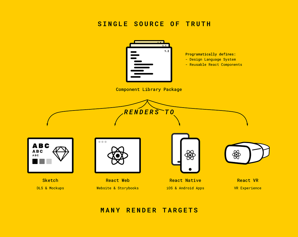 Our implementation of Airbnb and Jon Gold’s Single Source of Truth system.
Our DLS is defined and stored in one JavaScript package. The DLS contains information about colors, typestyles, sizes, and other design tokens. It also contains reusable base components that are frequently used in the application, like thumbnails, table cells, and headers. All of these are built as purely presentational components so that functionality can be customized.
Creating Cross-Platform Components
Here’s an example of a simple ProfileImage component built with React-Primitives:
import { Image } from 'react-primitives';import React from 'react'const ProfileImage = (props) => { return( <Image style={{ width: 40, height: 40, borderRadius: 20 }} resizeMode="cover" source={{uri: props.uri}} /> )}ProfileImage.defaultProps = { uri: "http://www.lucasmcgartland.com/profile_photo.jpg"}
export default ProfileImage
In use this would look like:
import { ProfileImage } from "your-universal-components-package"export default class App extends React.Component{ render(){ // Add prop uri to <ProfileImage/> to pass in your own image return( <ProfileImage/> ) }}App could be your React web app, React-Native app, or even a React Sketch app. Yes, it really is that simple to use primitives.
Rendering to all 5 Platforms
Now that our cross platform code was working, it was time to implement components that could be reused across the platform.
We built out a simple DLS styleguide that included some colors, typestyles, and components. Here are screenshots of an early version of our DLS rendering to all five platforms simultaneously.
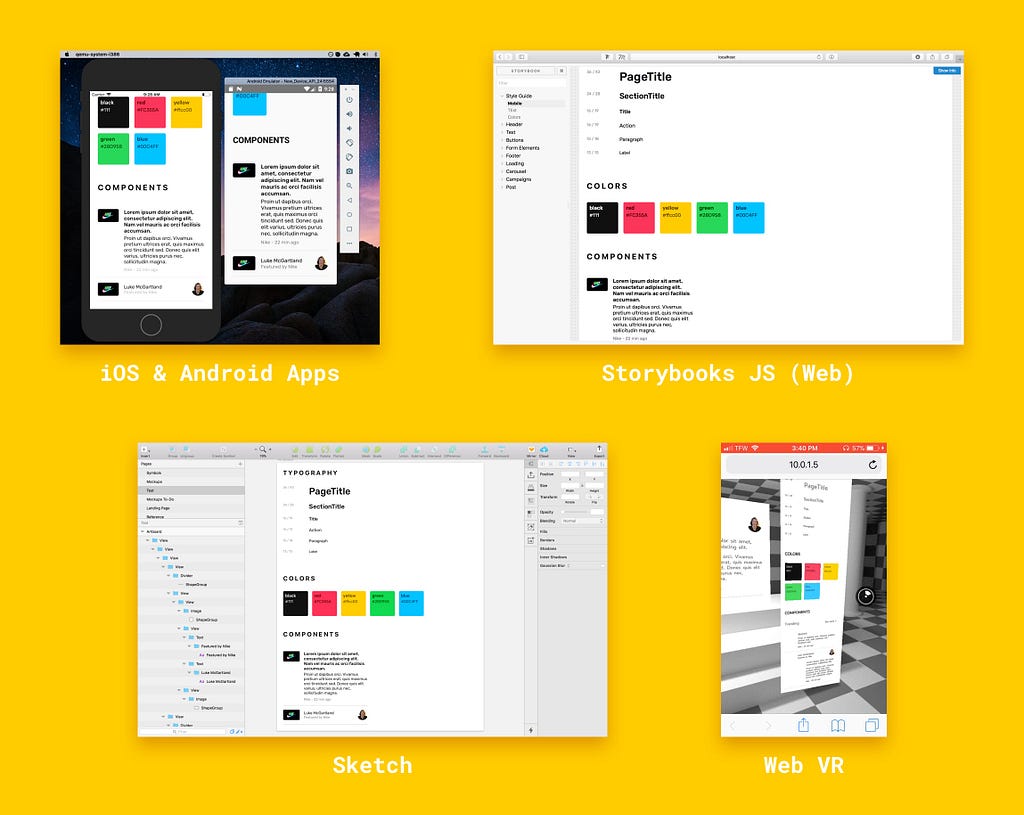 Our early DLS rendering to all 5 platforms
What’s amazing about rendering out the DLS this way is that by changing one variable (say a color swatch) the apps will instantly re-render to reflect the change (thanks to hot module reloading).
With this framework now in place, we continued to build upon the DLS, creating more reusable buttons, icons, cells, and other components.
Here’s an example of an updates feed rendering across platforms:
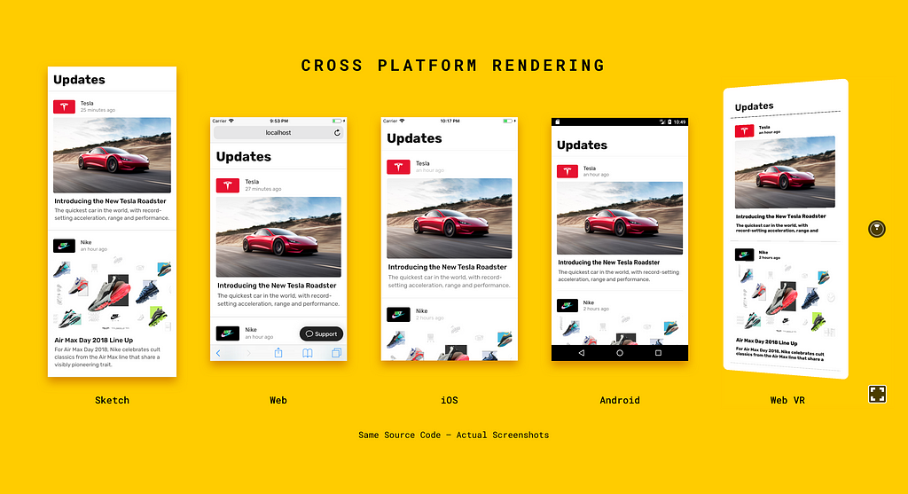 Rendering the same “updates feed” component across the 5 platforms. Note: React-VR currently doesn’t support multiple type styles.Animations
We even found that we could share animations across the web and native applications. Here’s an example of a button with a little “spring” to it rendering on iOS and web:
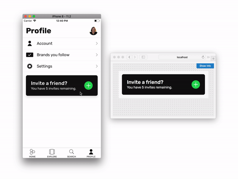 The button and the spring animation are cross platform thanks to the Animated API.Web VR
Just for fun, we also tried rendering out the components into a React-VR environment. While we still don’t know when Bee will create a VR experience, it’s nice to know that we have the option of using our existing components.
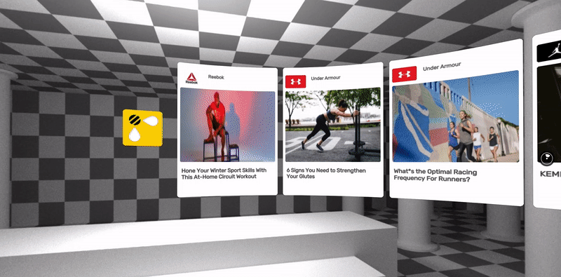 Here are some story cards from the explore feed rendering in VR
Project Structure
Maintaining a Universal Component Library, web app, React-Native app, DLS Sketch rendering tool, and documentation is not an easy task. This is why we decided to use Lerna to create a monorepo and break apart The Bee App into smaller pieces.
Here’s a look at our project structure:
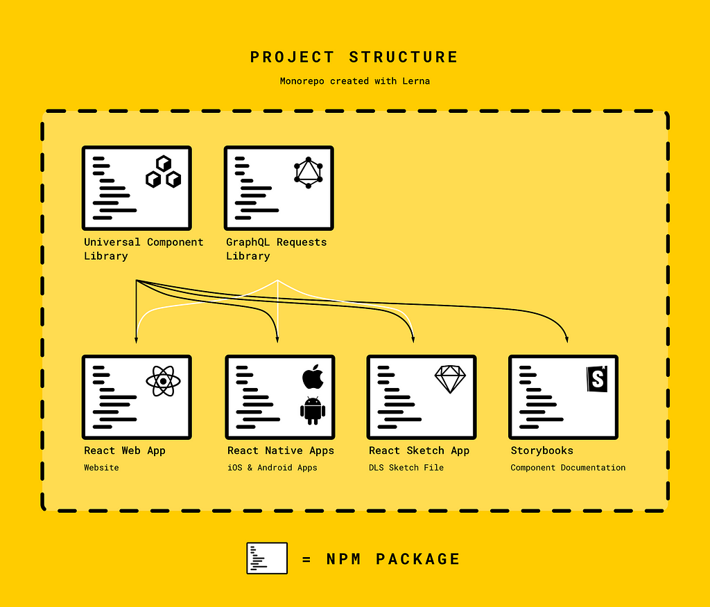 This is how our project is structured so that each part can reference the others.
This arrangement allows us share the component library and DLS easily between packages.
If you’re wondering about that GraphQL package, read on.
Making Our API Universally Accessible
In addition to making our user interfaces render universally, we needed to make data from our server universally available to them. We decided to use GraphQL as the communication layer between the client apps and the server. GraphQL offers flexibility and integrates well with React.
This led to us creating a package of reusable GraphQL queries, mutations, and fragments (basically the definition of the requests you want to make against the server). These requests run within Javascript on any of the platforms, and their results can be pushed into the components.
 We love GraphQL too
To make this process simple we used Apollo as our GraphQL client. This allowed us to wrap our presentational components from the Universal Component library with queries from our GraphQL package using higher order components. As soon as information that a component needs becomes available, the higher order component provides it via the props.
Finally we had a system where we could:
- Define what our app should look like, regardless of platform.
- Specify what data a component needs, regardless of platform.
- Reuse both components and data queries across platforms.
How Can a Universal Component Library Benefit Your Team?
Using a Universal Component Library and Design Language System offers many benefits. Here’s what your team can expect to gain from this methodology:
Designers
- Prototype with real data. Ping your API and pass the results directly into your mockups. This lets you see what your app will really look like (no more lorem ipsum).
- Prototype internationalization. Use Google translate to test how user interfaces look in other languages and output results side by side.
- Keep assets in sync with actual deployed code.
Developers
- Less code to manage. If you can reuse code across platforms, you can save time, effort, and energy.
- Code is all JavaScript. JavaScript powers the React side of all the applications, so engineers can seamlessly switch between working on the different platforms.
Business
- Do the math. If one engineer can now build for three platforms instead of one you’re going to save a lot of money, and it takes less time to ship for multiple platforms.
Wrapping Up
From here on out, our Design Language System will continue to grow and evolve along with our platform, becoming more modular and reusable. Going forward, I’d also like to build out a primitive interface for SVGs now that React-Sketchapp supports them.
I would really like to thank all the people who have contributed to React, React-Native, React-Primitives, and React-Sketchapp—none of what we built would have been possible without you. To the DLS team at Airbnb, thank you for showing us how a marriage between code and design can create amazingly powerful tools. And to the rest of the Bee team, who indulged my crazy dream of building a DLS pipeline for our crazy young startup, thank you.
If you’d like to join the Bee community, download the app and use invite code 072WT to sign up (valid for first 25 users only)
If you want talk more, chat about React or great typefaces, hit me up on twitter @lucasmcgartland. Or find me elsewhere on the web below:
Website | Email | LinkedIn | TwitterFurther Reading/Resources:
- Painting With Code: https://airbnb.design/painting-with-code/
- Building a Visual Design Language: https://airbnb.design/building-a-visual-language/
- How Airbnb Is Using React Native: https://www.youtube.com/watch?v=8qCociUB6aQ
Libraries Used:
- https://github.com/lelandrichardson/react-primitives/
- https://github.com/airbnb/react-sketchapp
- https://github.com/apollographql/apollo-client
- https://github.com/lerna/lerna/
Building Cross-Platform Applications with a Universal Component Library was originally published in Hacker Noon on Medium, where people are continuing the conversation by highlighting and responding to this story.
Publication date
Disclaimer
The views and opinions expressed in this article are solely those of the authors and do not reflect the views of Bitcoin Insider. Every investment and trading move involves risk - this is especially true for cryptocurrencies given their volatility. We strongly advise our readers to conduct their own research when making a decision.