Latest news about Bitcoin and all cryptocurrencies. Your daily crypto news habit.
Technical Analysis in 5 Minutes
Part 1: Candlestick and Volume Charts

Summary: These article series are intended for people who want to quickly learn about Technical Analysis with the focus on Cryptocurrencies. I only provide practical description and leave out the details. I use pictures from the free BitcoinCrazYness.com mobile app which provides interactive charts for quick technical analysis.
Disclaimer: I am not a financial advisor. The following is not financial advice. Predictions based on technical analysis are not always correct. Do your own research before investing.
The goal of Technical Analysis (TA) is to predict the future of the price and market trend by analyzing the historic data. The ultimate goal is to predict if the trend is up (AKA bullish) or down (AKA bearish).
Technical Analysis is often done on candlestick charts.
Candlestick Charts
Each candle represents the price of the asset during a time period (e.g. 1 day or 1 hour). There are several candlestick chart styles:
Standard Candlesticks (AKA Japanese Candlesticks)
Each candle indicates these values:
- Open: the price at the beginning of the time period
- Close: the price at the end of the time period
- High: the highest price during the time period
- Low: the lowest price during the time period
The color indicates:
- Green (or Hallow or Bullish): Close > Open
- Red (or Filled or Bearish): Close < Open
What do I need to know about Standard Candlesticks?
- On a Green candle, open is on the bottom, and close is on the top
- On a Red candle, open is on the top and close is on the bottom
- Body: between open to close is called body and it is thicker
- Wick (or Shadow): the thin parts above and below the body
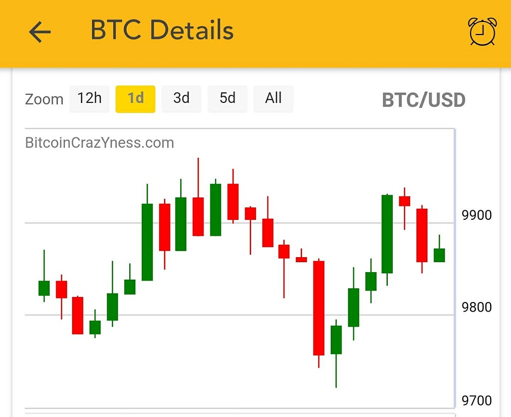 Standard Candlesticks — BitcoinCrazYness.comCandlesticks With Trend
Besides comparison of open and close values, candlestick chart with trend indicates the trend of price compared to the previous period.
In this style the candlesticks are either hallow or filled. Unlike standard candlesticks, the colors indicates changes in price compared to the previous period:
- Green: Close < last period’s Close
- Red: Close > last period’s Close
- Hallow: Close > Open
- Filled: Close < Open
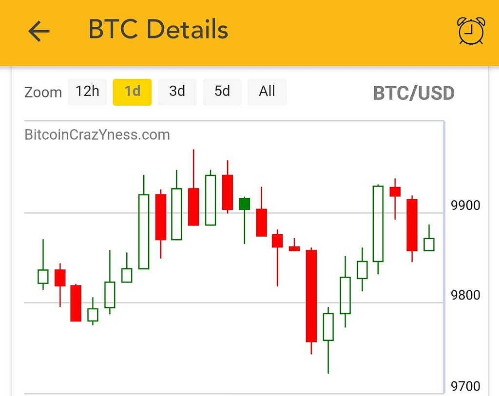 Candlesticks with trend. The color indicates the changes compared to the previous period — BitcoinCrazYness.com
What do I need to know about Candlesticks with trend?
- Consecutive filled or hallow candles indicate a down or up trend.
Heikin Ashi
The values are calculated from standard open, close, high, low values as follows:
- Close =(Open + High + Low + Close) / 4
- Open = (Previous HA-Open + Previous HA-Close) / 2
- High = Max(High, HA-Open, HA-Close)
- Low = Min(Low, HA-Open, HA-Close)
 Heikin Ashi Candlesticks. Usually has many consecutive candles of the same color — BitcoinCrazYness.comStandard Candlesticks. Compare to Heikin Ashi, it has more gaps between candles of the same color — BitcoinCrazYness.com
What do I need to know about Heikin Ashi?
- Heikin Ashi filters out the noise and helps to spot trends
- Each candle opens from the middle point of the previous candle
Common interpretations
- No lower wick: indicates strong buying pressure
- No upper wick: indicates strong selling pressure
- Two candles of a different color after several candles of the same color may indicate trend reversal
Volume Chart
Each bar represents the total number of trades per period. For a FROM/TO pair (e.g. BTC/USD), you can choose to see the FROM or TO volume.
The colors indicate:
- Green: Close < last period’s Close
- Red: Close > last period’s Close
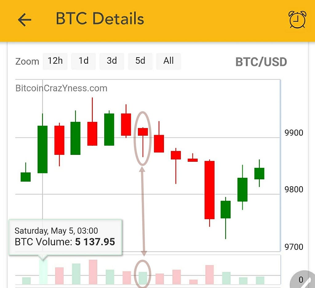 Volume Chart — BitcoinCrazYness.com
As shown in the above picture the colors are not always the same as standard candlestick colors.
Common interpretations:
One can use the volume and price to interpret the trend.
The trend is up (Bullish) if:
- Both Volume and price are going up compared to previous periods
- Both Volume and price are going down compared to previous periods
The trend is down (Bearish) if:
- Volume is going up, but the price is going down (Represented by a taller green bar or a shorter red bar compared to the previous period in the volume chart)
- Volume is going down, but the price is going up (Represented by a taller red bar or a shorter green bar compared to the previous period)
See the picture below:
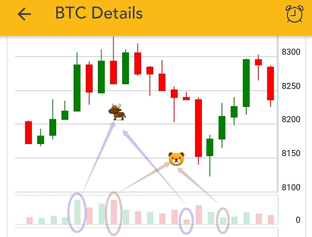 Interpreting the trend being bullish or bearish from volume and price graphs— BitcoinCrazYness.com
End of Part 1
If you liked this article please let me know in the comments. Also, please check out the free BitcoinCrazYness.com mobile app which provides interactive charts for Bitcoin and other cryptocurrency altcoins. It sends alerts on price, volume, and market cap and indicators such as MACD, RSI, and Ichimoku.

Practice Technical Analysis for Cryptocurrency in Five Minutes was originally published in Hacker Noon on Medium, where people are continuing the conversation by highlighting and responding to this story.
Publication date
Disclaimer
The views and opinions expressed in this article are solely those of the authors and do not reflect the views of Bitcoin Insider. Every investment and trading move involves risk - this is especially true for cryptocurrencies given their volatility. We strongly advise our readers to conduct their own research when making a decision.